National Geographic App
The National Geographic iOS and Android app provides a convenient way for users to access magazine archives, an extensive photo library, digital articles, and over 3,000 videos. Through a personalized feed, the app empowers users to discover the world through National Geographic’s rich content.
Role:
Lead UX/UI Designer
Launch Date:
Winter 2018
Where We Began
The National Geographic app originally launched in the Australia market in partnership with a telecommunications company, Optus. For the US launch, National Geographic’s goals were to improve the user experience, align with updated brand standards, and to provide a platform that can grow with changing business initiatives.
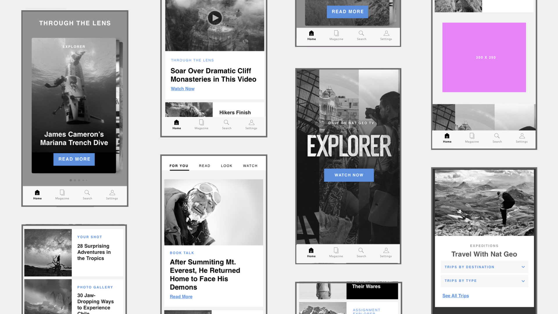
The Wireframes
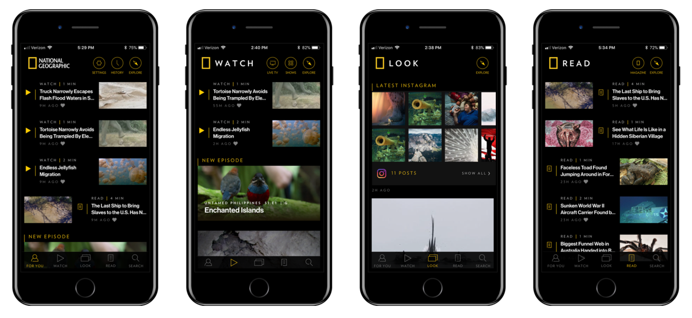
Wireframes show the structure of the main content feed, along with interstitials to break up the continuous scrolling. During testing, all users understood and enjoyed the navigational structure of “FOR YOU,” “READ,” “LOOK,” and “WATCH.”
Partner Linking User Journeys
Launched in Australia in partnership with a telecommunications company, the National Geographic App provides access to our long form TV series, and archive back to 1888. These flows show how an Optus customer in the Australian market would gain access to the app.
Testing Methods
The Goal:
Test the new app design using focus groups and usertesting.com to examine reactions from current and potential subscribers, understand potential pain points, and evaluate feature usage / interaction. Specific tasks we had users do were to sign in and subscribe. We had users describe their actions and explain what they thought that meant.
Outcome:
Users liked the app, and had little to no issue using it, and were excited to explore. They said the visual design is compelling, and the presentation retains the ‘WOW’ factor. UI is clean, accessible. The app feels like a welcome update to the brand, and a reminder to engage with our content when on the go. The app reinvigorated interest in our brand and content.
On-boarding
We implemented an intuitive and friendly on-boarding experience that alerts users to restore previous purchases, personalize your feed based on topics, and turn push notifications.
Magazine Tab
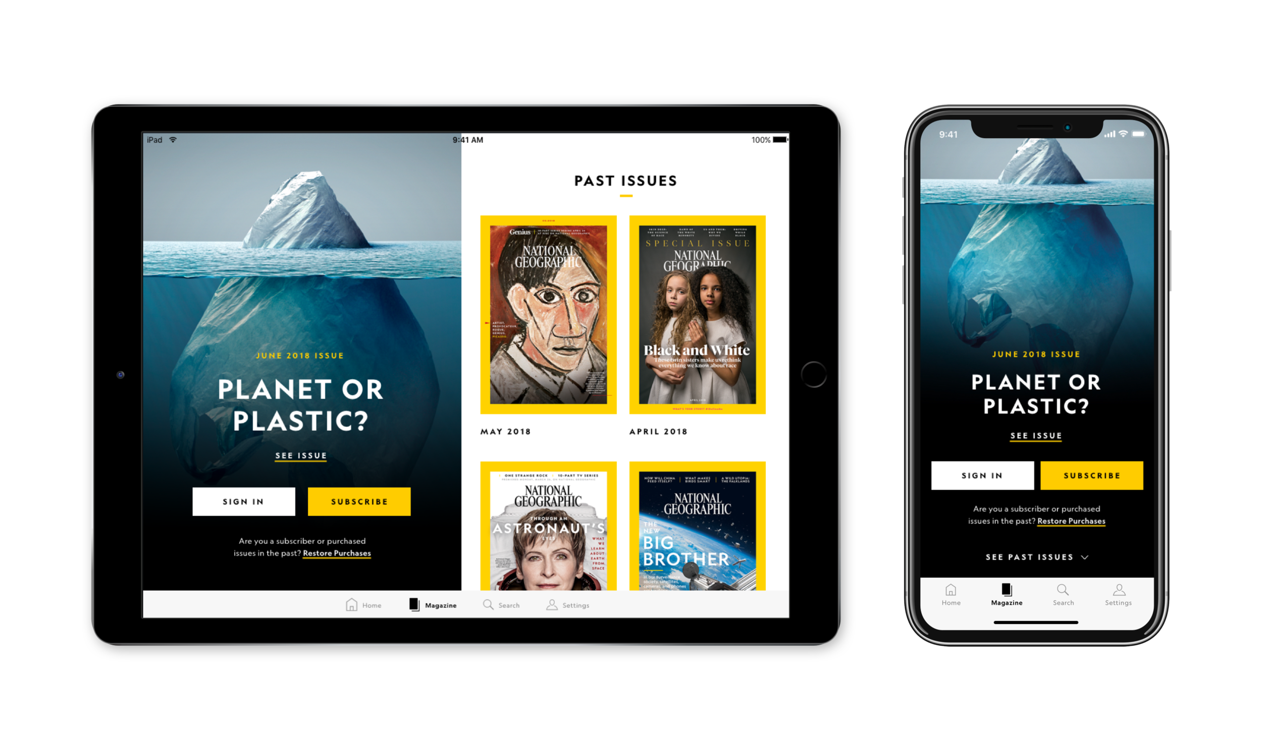
Prior to 2018, The National Geographic app had not been updated since 2012. It built on Adobe DPS, and was a PDF page flip experience. With the update, we wanted to create a more modern, intuitive user experience, and really focus on premium magazine content. The update is more mobile friendly, and follows a vertical scroll format rather than horizontal page swipes.
Content Feeds
With the app update, we included daily published content – photo libraries, videos, and articles. We incorporated a “card” based system that emphasizes photography and aligned with our brand standards. We organized the feed by content types. “Read,” “Look” and “Watch.” We also included personalized “For You” feed that continuously improves as users consume content.


